Choosing a color scheme for your living room isn’t just about aesthetics, it sets the mood for your whole home. The right palette can make a small space feel larger, a dim room brighter, or a cold space warmer. With so many options out there, homeowners often get overwhelmed by living room color ideas and end up playing it safe with beige. But 2026 brings fresh approaches to color that blend timelessness with contemporary edge. Whether you’re drawn to calm neutrals, bold accents, or moody drama, this guide walks you through 13 proven color combinations that actually work in real homes, not just magazine spreads.
Table of Contents
ToggleKey Takeaways
- Living room colors ideas work best when anchored to fixed elements like flooring and existing furniture, with warm neutrals, bold accents, soft pastels, and dark moody hues each offering distinct design benefits.
- Test paint samples on multiple walls over 24 hours and observe in different lighting conditions—morning, afternoon, and evening light significantly alter how colors appear before you commit to painting.
- Bold accent colors should be applied strategically to just one wall or below a wainscoting line to reduce paint costs and allow for easier repainting if design preferences change.
- Dark, moody living room colors require adequate layered lighting, light-colored trim, and contrast with furnishings to create sophistication without making the space feel cave-like.
- Quality interior paint costs $30–$50 per gallon plus primer and preparation supplies; professional painters charge $1,500–$3,000, making proper prep work and testing essential to avoid costly mistakes.
Warm Neutral Palettes for Timeless Comfort
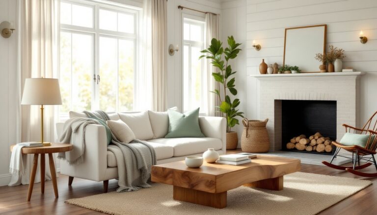
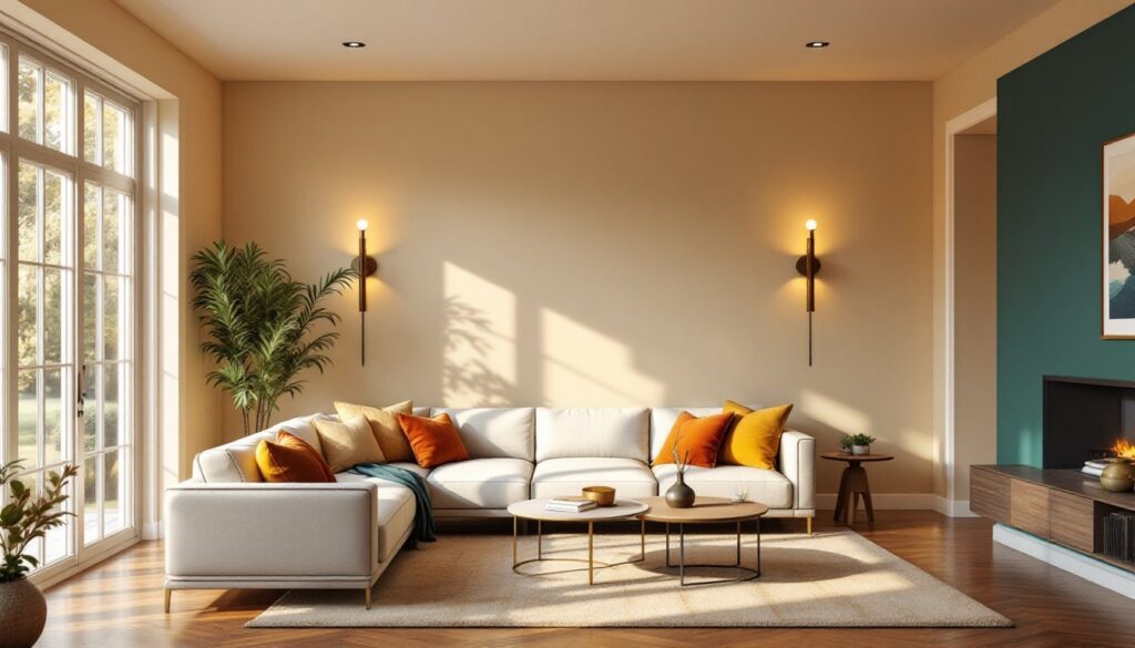
Warm neutrals remain the foundation of most successful living rooms because they’re genuinely forgiving and age well. Think warm grays, creams, taupes, and soft browns that lean toward honey and caramel tones rather than cold ash grays.
These colors work because they reflect light differently depending on time of day and existing fixtures. A warm gray like Benjamin Moore’s Accessible Beige or Sherwin-Williams’ Urbane Bronze (lighter applications) provide depth without the harshness of pure gray. Pair warm neutrals with natural wood tones, oak, walnut, or pine, and they create instant cohesion.
The beauty here is flexibility. Your furniture and art can shift from cool-toned to warm-toned without clashing. Throw in accent pillows, a rug, or artwork in deeper chocolates, golds, or rust tones, and the space gains personality without a full repaint. Paint coverage runs roughly 300–400 square feet per gallon for walls with standard primer, so measure your room before buying to avoid waste or multiple trips. For a living room with 10-foot ceilings and roughly 400 square feet of wall space, plan on two gallons of quality interior paint.
Bold and Saturated Accent Colors
If warm neutrals feel too safe, bold accent colors give living rooms instant character and energy. Saturated teals, deep oranges, forest greens, and jewel-tone purples are trending because they’re rich enough to anchor a room without feeling cartoonish.
The trick is applying bold color strategically. Paint one accent wall rather than all four, or use color on a lower half (below a wainscoting line at 36 inches) and leave upper walls neutral. This approach reduces paint cost and makes repainting easier if tastes shift. A living room colors ideas resource from home design specialists often highlights how one saturated wall can define the entire space.
Consider Farrow & Ball’s Hague Blue (a sophisticated petrol blue), Sherwin-Williams’ Urbane Bronze, or Benjamin Moore’s Caliente (deep red-orange) for impact. Pair these with natural light exposure, a room with afternoon sunlight can handle darker, more saturated tones than a north-facing room. Avoid glossy finishes on bold colors: stick with matte or eggshell to minimize visual intensity. Pro tip: always test a large swatch (at least 2 feet by 2 feet) on your actual wall and observe it over two days in different lighting before committing.
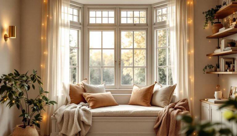
Soft Pastels and Muted Tones
Soft pastels, think dusty rose, sage green, soft lavender, and pale blue-gray, have made a quiet comeback because they’re calming without feeling sterile. They work particularly well in smaller living rooms or spaces with limited natural light, where deep colors might feel claustrophobic.
Muted pastels pair beautifully with light, minimal furnishings and whitewashed or light wood accents. They also read differently than bright pastels: a muted sage is sophisticated where a bright green can feel juvenile. Look for paints that include gray undertones, these “grayed” pastels feel more mature and timeless than straight pastels.
A beach style living room often employs soft sandy taupes and pale aquas, while cottage style living rooms lean into soft greens and creams. These styles prove muted pastels work across different aesthetic directions. The challenge is avoiding a washed-out look: pair pale walls with deeper accent colors in accessories, trim, or artwork to create visual interest.
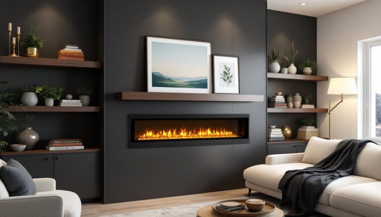
Dark, Moody Hues for Modern Elegance
Dark living room colors, deep charcoal, forest green, and rich burgundy, create sophisticated, intimate spaces that feel luxurious rather than gloomy. The key is adequate lighting and contrast with lighter trim or furnishings.
Navy and Charcoal Combinations
Navy and charcoal work together because they’re dark enough to feel moody yet neutral enough to pair with almost any decor style. Navy (a blue-leaning black) pairs exceptionally well with warm metals like brass and copper. Charcoal (a gray-leaning black) anchors modern and industrial schemes.
When painting dark colors, invest in quality primer, two coats of primer plus two coats of paint is standard for deep colors to prevent bleed-through and ensure even coverage. Dark paint also shows dust and imperfections more readily, so proper wall prep (filling holes, sanding rough spots, cleaning) matters more than with light colors.
Pair dark walls with light ceilings, trim, and at least one large light-colored furniture piece (sofa, sectional, or oversized chair) to prevent the space from feeling cave-like. Add layered lighting, overhead fixtures, wall sconces, and table lamps, to brighten the space and highlight color depth. Wall lights for living rooms become essential in dark schemes: they break up wall monotony and add warmth. A living room with limited natural light benefits from moody colors because artificial light can be controlled and layered.
How to Choose the Right Color Scheme for Your Home
Selecting a color scheme isn’t guesswork if you follow a few practical steps. Start by assessing what’s fixed in your room, flooring, built-ins, existing furniture you’re keeping, or architectural details. These anchors determine which color families will feel cohesive.
Next, measure your room and understand its lighting. Interior Ideas: Transform Your space considerations often emphasize that a north-facing room (cool, indirect light) handles warm colors better than a south-facing room (bright, warm light) where cool tones prevent overheating the visual field.
Consider Your Lighting and Room Size
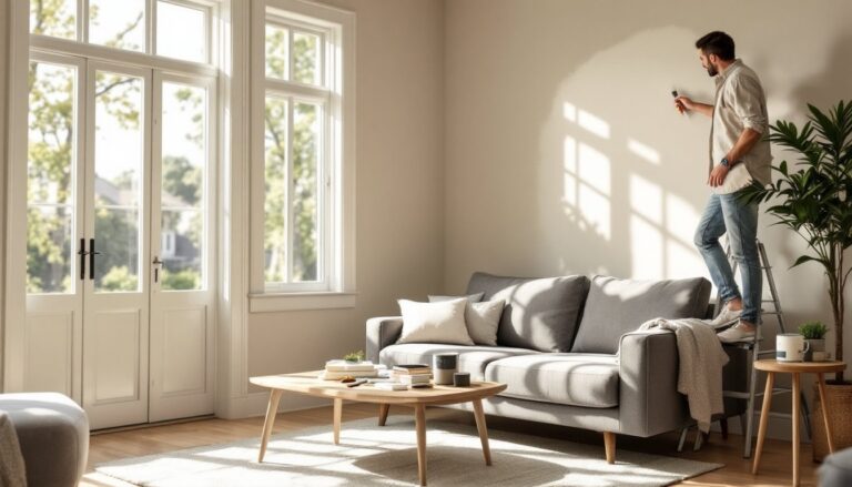
Natural light exposure is non-negotiable for color selection. Morning light is warm (golden), afternoon light shifts neutral, and evening light turns cool (blue). A color that looks great at noon might feel off at 6 p.m. Always test paint samples on multiple walls and observe over 24 hours.
Room size matters too. Small rooms benefit from lighter, cooler tones that recede visually and expand perceived space. Larger rooms can handle deeper, warmer colors without feeling cramped. If you’re unsure, choose a neutral base (walls) and introduce bolder color through furnishings, which are easier to swap than paint.
Budget also affects your approach. Quality paint costs $30–$50 per gallon for mid-range interior paint: premium paints run higher. Factor in primer, rollers, drop cloths, and tape. If you’re not confident painting yourself, hiring a professional costs $1,500–$3,000 for a typical living room, depending on surface condition, complexity, and region. Get three quotes before committing. Designer resources like Homedit and Home Bunch showcase real-world color applications that help visualize how tones work in finished spaces.
Final Thoughts on Living Room Color Selection
The best color for your living room is one you’ll enjoy waking up to for years, not a trend that feels dated in six months. Start with one of these 13 approaches, test samples generously, and trust your instinct. Remember: paint is temporary. If a color doesn’t work, repainting is always an option. The investment in quality primer, paint, and proper prep work pays off in a finish that looks professional and lasts without chipping or fading prematurely.