Paint color might seem like a small decision, but it’s one of the biggest visual anchors in any room. Your living room sets the tone for your entire home, so choosing the right paint color can either make the space feel inviting and cohesive or throw the whole aesthetic off balance. Whether you’re planning a subtle refresh or a complete overhaul, finding the perfect hue requires more than scrolling through Instagram. You’ll need to consider lighting, existing décor, and your personal style to land on a color that works for your unique space. This guide breaks down how to choose, what’s trending, and how to execute the project like a seasoned DIYer.
Table of Contents
ToggleKey Takeaways
- Choosing the right paint colors for your living room requires evaluating lighting conditions, room size, and existing décor before committing to a color.
- Neutral paint colors like warm whites, soft grays, and muted greens provide a versatile foundation, while bold hues like forest green and terracotta make sophisticated statements when properly lit.
- Warm tones encourage gathering and intimacy, while cool tones promote relaxation and spaciousness—select based on your room’s purpose and natural light availability.
- Proper preparation, quality materials, and correct application technique (primer, two paint coats, maintained wet edges) are essential for professional results.
- Test paint samples on large wall patches for several days under your actual lighting conditions to avoid buyer’s remorse.
How to Choose the Right Paint Color for Your Living Room
Picking a paint color without a plan often ends in buyer’s remorse. You need to evaluate your space systematically before committing to a gallon.
Consider Lighting and Room Size
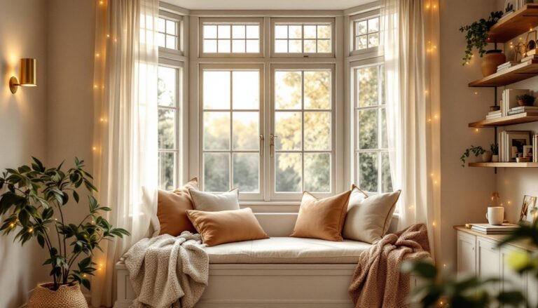
Lighting transforms color perception more than most people realize. The same shade of blue looks completely different under cool fluorescent bulbs versus warm afternoon sunlight. North-facing rooms receive cool, indirect light that can make warm colors feel flat and cool colors feel moody. South-facing rooms get warm, direct sun that brings out richness in jewel tones but can make pale colors feel washed out.
Before painting, observe your living room at different times of day. Notice how sunlight moves across walls. If you have mostly artificial lighting, check whether your bulbs are warm white (2700K) or cool white (3000K+). Paint swatches on a large patch of wall, at least 2 feet by 3 feet, and live with them for a few days under your actual lighting conditions. Most paint stores will give you sample quart sizes for this exact purpose.
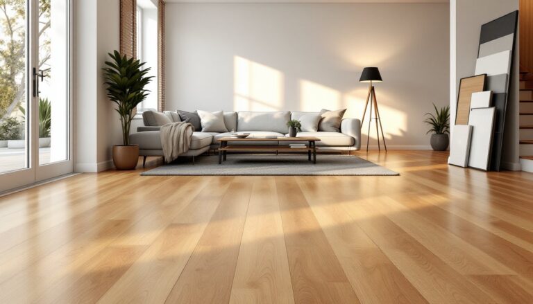
Room size matters too, though not always the way you’d think. Contrary to popular belief, light colors don’t always make small rooms feel bigger: the right medium tone with good contrast can feel more spacious because it creates visual interest. Conversely, a dark color in a large room with poor light can feel cave-like. If your living room lacks natural light and has 8-foot ceilings, aim for colors at least in the light-to-medium range. Rooms with 9+ feet of ceiling height and good windows can handle deeper tones.
Match Your Design Style and Existing Décor
Your paint color needs to work with what’s already in the room. Flooring, furniture, and cabinets establish a foundation. Pull color samples that coordinate with your existing pieces rather than forcing a color that clashes with hardwood you love or a gray sofa that’s staying put.
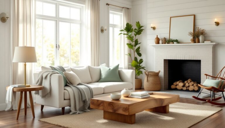
Identify your design style first. Are you leaning toward warmth, modern minimalism, or something in between? Once you know your direction, narrow your color palette. A cottage aesthetic works beautifully with creams, sage greens, and soft terracottas. Modern spaces often pull from grays, whites, and muted blacks. If you’re unsure about your style, gather images of living rooms you genuinely love, not ones that look “right,” but ones you’d actually want to live in. Common colors in those images reveal your natural preference.
Also consider trim and doors. White or cream trim reads differently against soft blue versus deep navy. Dark wood trim can ground bold wall colors but might feel heavy with pale paint. If you’re not repainting trim (which most DIYers skip), your wall color needs to complement what’s there.
Best Neutral Paint Colors for Living Rooms
Neutrals remain popular because they provide a stable backdrop for furniture, art, and accent colors. But “neutral” doesn’t mean boring, there’s enormous range within this category.
Warm whites and creams (like Benjamin Moore’s “Simply White” or Sherwin-Williams “Alabaster”) feel inviting and work well with traditional or transitional décor. They’re still crisp enough for modern spaces if paired with clean lines and minimal accessories.
Soft beiges and warm grays sit between white and deeper tones and feel less clinical than pure white. These work across styles because they don’t compete with other elements. Look for beiges with brown undertones rather than yellow undertones, which can feel dated. Warm grays, sometimes called “greige”, are hugely popular right now and bridge neutral and color territory.
Cool grays range from barely-there light gray to substantial medium tones. They pair beautifully with blue accents, or keep a space feeling calm and collected. Avoid very pale grays if your room has yellow undertones in the flooring or existing paint: they’ll fight each other.
Soft taupe works as a neutral with slight warmth. It’s less common than beige but offers sophistication without the boldness of color. Taupe suits transitional and contemporary spaces well.
When choosing a neutral, buy the sample size and test it against your flooring in actual light. Bring paint chips home and lay them next to your sofa, rug, and any artwork that’s staying. The paint should complement, not clash.
Trending Bold Colors That Make a Statement
If you’re ready to move beyond neutrals, 2026 trends lean toward deeper, more saturated hues that feel intentional rather than trendy.
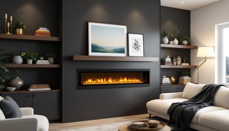
Deep forest green remains strong in design. It brings sophistication and pairs well with brass hardware, wood tones, and natural textiles. This color needs good light to avoid feeling gloomy, but in a room with decent windows or layered lighting, it’s stunning. It works for eclectic spaces too if balanced with lighter accents.
Warm terracotta and ochre bring earthy, grounded energy. These mustard and rust tones are perfect for spaces leaning bohemian or cabin-style. They’re less stark than typical bold colors and age gracefully.
Muted blues, think soft slate or dusty periwinkle, offer color without intensity. They’re versatile enough for most styles and less risky than saturated shades. Navy and deep indigo work in larger rooms with strong light but can feel heavy in smaller, darker spaces.
Warm charcoal and soft black have gained traction for accent walls or full-room applications. These work best in modern or industrial aesthetics and require high-quality lighting to prevent the room from feeling dark.
Sage and muted greens bridge neutral and color beautifully. They’re calming, coordinate with most décor, and read as sophisticated rather than trendy. According to interior design inspiration resources, these softer greens are increasingly popular among designers.
Bold colors demand commitment. Test them extensively, and consider applying one to an accent wall first if you’re hesitant. You can always paint the full room once you’re confident.
Warm vs. Cool Tones: What Works Best
Every color falls somewhere on a spectrum from warm to cool, and this distinction affects how a space feels.
Warm tones (reds, oranges, yellows, and warm browns) create energy and intimacy. They make spaces feel smaller and cozier, which is ideal for living rooms where you want to encourage gathering. Warm neutrals like cream and warm gray feel welcoming. But, warm tones can feel overstimulating in high-stress households or spaces where you want calm.
Cool tones (blues, purples, cool greens, and cool grays) promote relaxation and make rooms feel more spacious. They’re excellent for living rooms where you want a serene atmosphere. Cool tones work well in rooms with bright, natural light. In rooms with limited light, cool tones can feel cold rather than calming.
Your choice depends on the room’s purpose and your climate. In warm climates, cool tones feel refreshing. In cooler regions or dark winters, warm tones feel more livable. Also consider how you use the space. If it’s your primary entertaining zone, warm tones encourage lingering. If it’s a retreat space, cool tones might serve better.
Lighting temperature matters too. Warm white bulbs (2700K) interact differently with cool paint than with warm paint. A cool blue under warm lighting can feel muddy, while a warm cream under the same light glows beautifully. Conversely, cool white bulbs (3000K+) can make warm paint look harsh. Match your lighting strategy to your color choice.
For multi-style spaces, a neutral base with warm or cool undertones lets you layer accent colors without confusion.
Practical Tips for Painting Your Living Room
Choosing the color is half the battle: execution makes or breaks the result.
Prep is everything. Move furniture to the center of the room and cover it with plastic sheeting. Remove outlet covers and light switch plates. Use painter’s tape along the ceiling line, baseboards, and trim. Poor prep leads to sloppy lines and paint cleanup that eats time. Wash walls with a TSP (trisodium phosphate) solution to remove dust and grime, which prevents paint adhesion. Let walls dry completely, at least 2-4 hours, before painting.
Prime if needed. If you’re covering a dark color with a light one, or if the existing paint is glossy or damaged, prime first. A good primer prevents bleed-through and ensures even coverage. One primer coat plus two paint coats is standard for color changes. Your paint supplier can recommend a primer that works with your specific paint and existing surface.
Invest in quality paint and tools. Budget paint often requires three coats to hide the walls underneath, negating savings. Mid-grade or premium paint typically covers in two coats with better color accuracy. Cheap brushes shed bristles into your walls. Spend a little more on a quality 2-inch angled brush and a 9-inch roller with a nap appropriate for your wall texture (3/8-inch nap for smooth walls, 1/2-inch for lightly textured, 3/4-inch for heavily textured).
Apply paint correctly. Cut in around edges with a brush first, creating a 2-3 inch border. Then roll the main wall area with overlapping vertical strokes. Work in manageable sections (roughly 4 feet by 4 feet) before the paint dries. Maintain a wet edge so you don’t see lap marks. Two coats are standard: apply the second coat after the first dries completely (typically 4-8 hours, depending on humidity and ventilation).
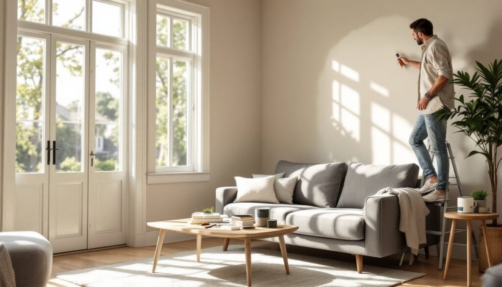
Consider hiring help for high ceilings or large rooms. Living rooms often have 9-10 foot ceilings, making ladder work tiring and safety-intensive. A second set of hands on a ladder or roller significantly speeds up the project and reduces fatigue-related mistakes.
Ventilate properly. Open windows and use a fan, even with low-VOC paint. Paint fumes are real, and proper air circulation speeds drying. Interior painting can take 2-3 days from start to reassembly, depending on coats and drying time. Check resources like young house love for detailed DIY painting tutorials that walk through the full process step by step.
Safety matters. Wear gloves to protect skin and avoid staining. Use a respirator if you have sensitivities to paint fumes, especially if painting for 4+ hours continuously. Ensure ladders are stable and never overreach: move the ladder instead. If you’re using a ladder on hardwood or tile, place a mat underneath to prevent slipping.